

Can we talk about neutral colours for a moment?
Firstly, what constitutes a neutral? For me it’s a colour that isn’t leaning towards any particular colour group, if that makes sense. I suppose another criteria would be that it goes with everything, or most other colours. It starts with white, black, and grey, of course, but then for me it extends to beiges, oatmeals, browns, and creams. I was talking about it with Claire though and was surprised when she brought out dark blues as neutrals - to me they’re just blue, which is not a neutral, but as she pointed out - in the fashion world dark blue is considered a neutral colour. Think about it - when you’re shopping for smart pants or jackets for work you’ll get grey, black, and blue as the standard basic colours. So in that sense I understand why dark blue could be considered a neutral shade. Would you consider it to be?

Anyway, the reason for this speculation is because I wanted to make sure you are able to identify some or most of the ECY neutral shades. I often get asked for them, and I always include as many as I can in updates because I believe we need them to frame other colours, as well as providing a canvas for beautiful stitch patterns and textures. I think neutral shades are soothing and calming - I even have a grey bedroom! Hopefully this blog post will give you a good idea of which colours to look out for - don't forget you can always use the search box on the website.
Let’s start with a few greys. We do have a lot of colours that are nearly-grey, for example Robin Egg is a grey-turquoise, and Pennine Mist is a grey-blue.. But I haven’t included those because to me they’re more of the colour than the grey, if that makes sense?!
Our palest grey is Silver Birch, which is a slightly greenish silvery grey; and similar to that is Milburn 4ply and DK in Rain (below). Rain is perhaps marginally more blueish than Silver Birch. It’s gorgeous if you need something to lift your palette.

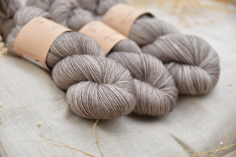
Our other greys include Milburn 4ply and DK in Steel, plus hand dyed yarns in Steel - this is more of a medium-toned grey (warm grey, I’d say), and it has a slightly darker sibling called Ash (below). Even darker than that we then have Charcoal (below) - again this is available on Milburn 4ply and DK as well as hand dyed.


For a truly light colour we have Milburn 4ply and DK in Natural, which is the natural cream of the BFL fleece. It’s NOT white - we don’t have actual white because that would require bleaching the fibres, which isn’t something we’d like to do. The different yarn bases are different creams though - Brimham 4ply in Natural for instance would be more white compared to the light cream of Milburn. We sell Whitfell DK (below) and Chunky in Natural too - baby alpaca comes in a natural creamy white, which is useful.

For a truly dark colour, ie black, have a look at Whitfell Chunky in Coal, which is jet black. I do also do a hand dyed version of Coal but that is NOT jet black - it’s a semi-solid colour which ranges from dark grey to black; it has highlights in it which you don’t get with jet black. It does make it a bit more interesting to knit with though.
Going back to cream, I have a few colours that could be considered cream - well I think they are. We’ve got Linen which is a barely-there, pearlescent colour, and then just a bit darker than that we’ve got Whispering Grass(below) (as in the wispy stuff, not the green lawn stuff). Any darker than that and I think you’re into a full-on sand colour, which to my mind isn’t really neutral.

We’ve got lots of beige colours, too. The lightest is probably Driftwood; this is one of my oldest colourways and it remains a popular classic to this day. It’s a slightly pinky-beige, whereas Stone (below) is similarly light-toned but is more of a cool-beige. Wicker, which is a Milburn shade is similar to them both - it’s probably somewhere in between.

One of my all-time favourite colours is Bark (below) - this is darker than the beige shades, but isn’t a brown or grey either; it’s a sort of mouse-brown I suppose, with a medium level of saturation. It’s soft, calm, and warm. It goes well with a lot of other shades, but particularly pinks and blues.
Moving on to darker shades from there we’re into browns - again I have quite a few: Oak (below) is a rosy pink-brown, Dark Oak is its darker sister; and Compost is our dark grey-brown.

So there you have it.. That’s a round up of what to me are neutral colours, and there are usually several of these in every single update we do. Are there any that I'm missing? Let me know in the comments!
